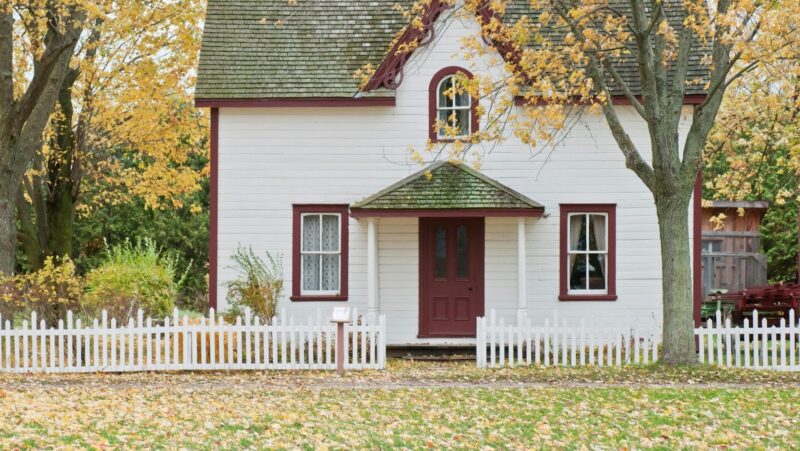
This is the idea behind quiet luxury, which isn’t about minimalism or empty rooms, but a layered approach to design where every material contributes to the overall atmosphere rather than competing for attention. The move away from trend-driven interiors is already well underway, influencing how people think about everything from flooring to tile selection.
What Is Quiet Luxury, Really?
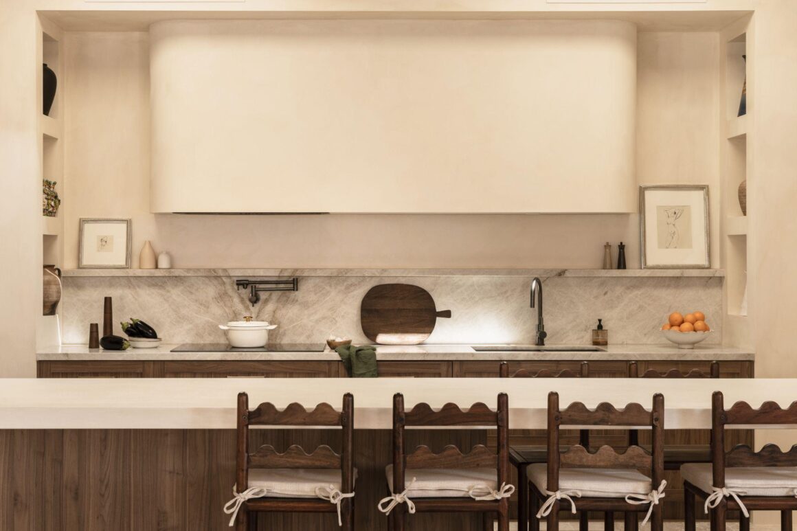
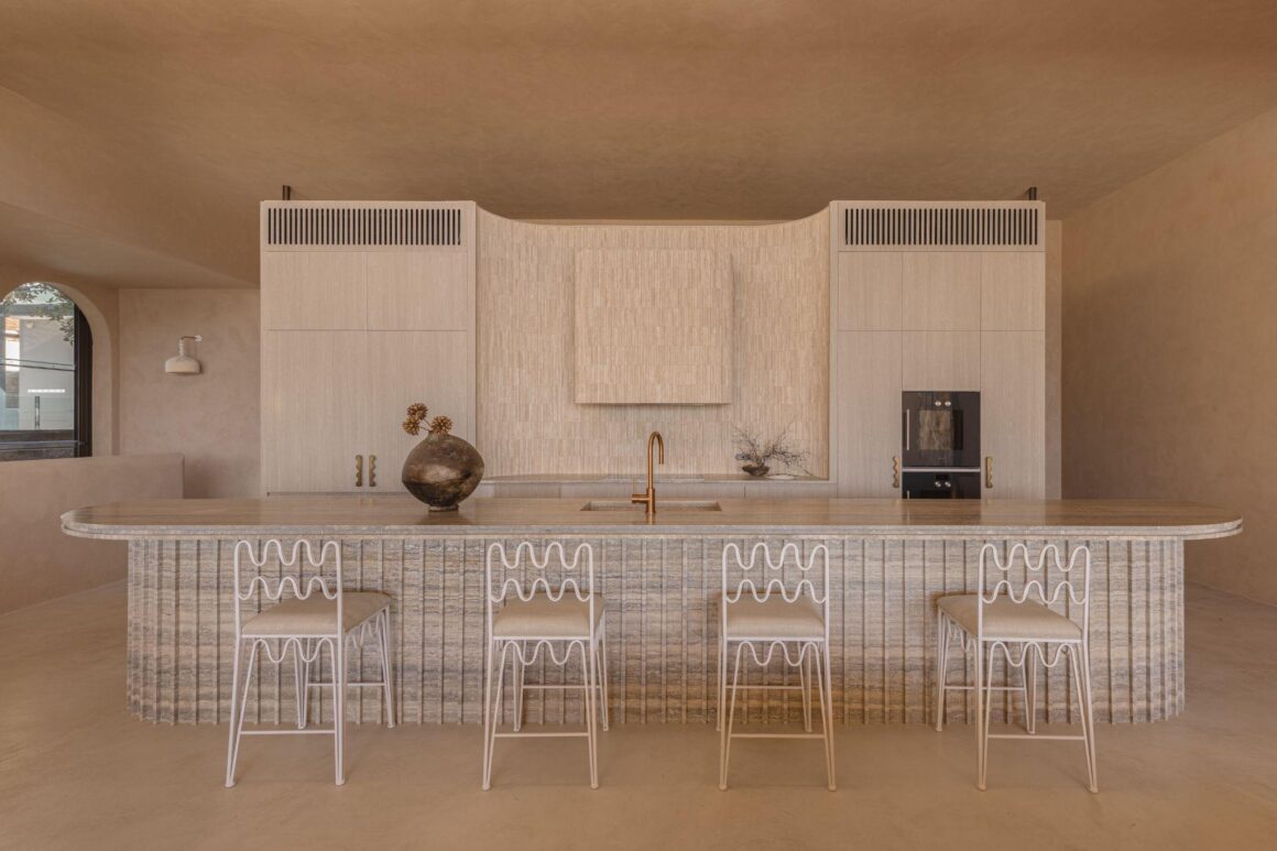
Quiet luxury isn’t about having less; it’s about choosing more carefully. Unlike minimalism, which often centres on restraint, quiet luxury focuses on creating depth through thoughtful layering and considered design choices.
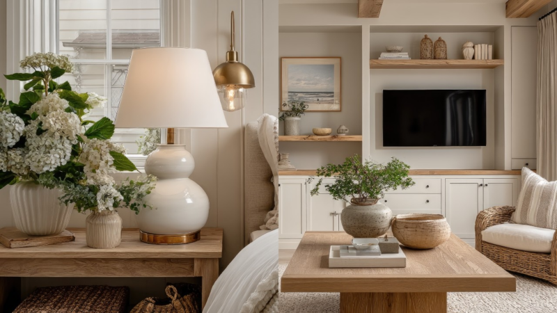
Rather than relying on statement pieces to capture attention, it uses natural textures, warm neutral tones, subtle detailing, and a cohesive material palette to create a sense of balance. Every element has a role to play, contributing to a space that feels intentional without feeling overdesigned. The result is an interior that feels calm, welcoming, and effortlessly sophisticated.
Why Material Consistency Makes Rooms Feel Bigger
Here’s something most people don’t realise: visual consistency doesn’t just look good, it actually makes spaces feel larger.
When materials contrast sharply from room to room, the eye has to constantly recalibrate. A high-gloss kitchen giving way to a rustic living room, or a cool grey bathroom following a warm-toned bedroom, creates a visual friction. This is subtle, but it makes a home feel smaller and more disjointed than it actually is.
When tones and textures relate across spaces, the eye moves freely, and the home feels more expansive, more connected, and more cohesive.
Key things that create this effect:
- Consistent flooring tones across connected rooms
- Wall finishes that sit within the same colour family
- Hardware and fixtures that complement rather than contrast
- Repeated materials across wet and dry zones
This is why cohesive homes often feel more luxurious, even when individual elements are modest.
The Rise of Tonal and Textural Layering
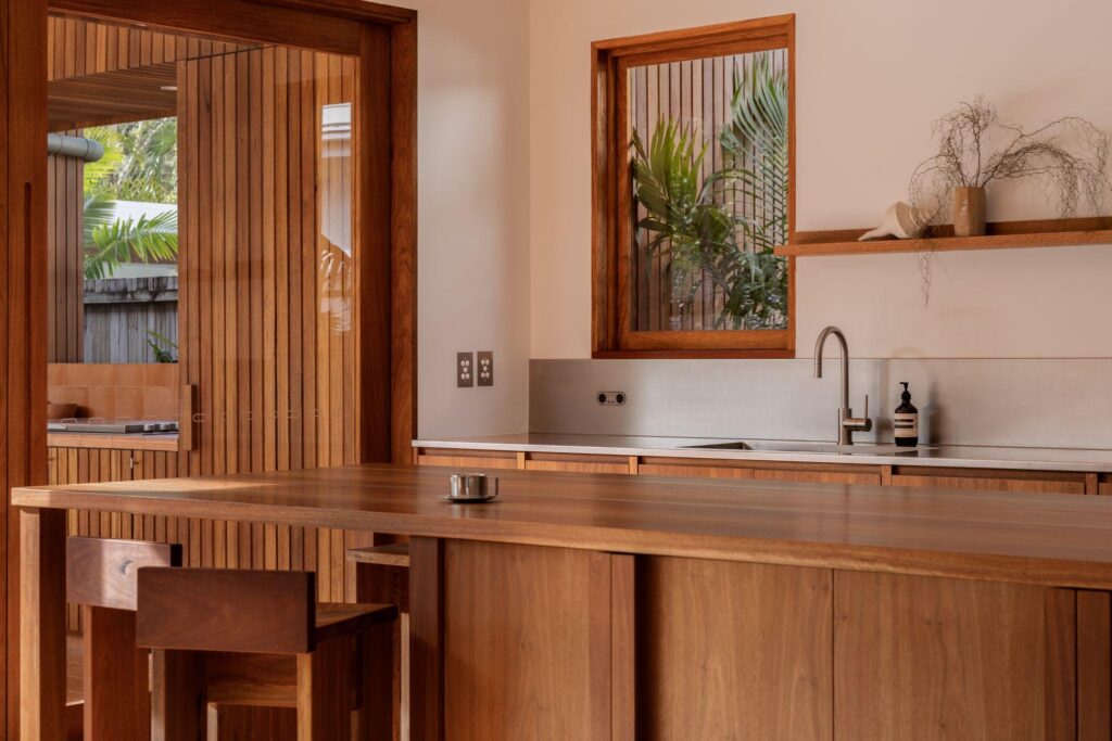
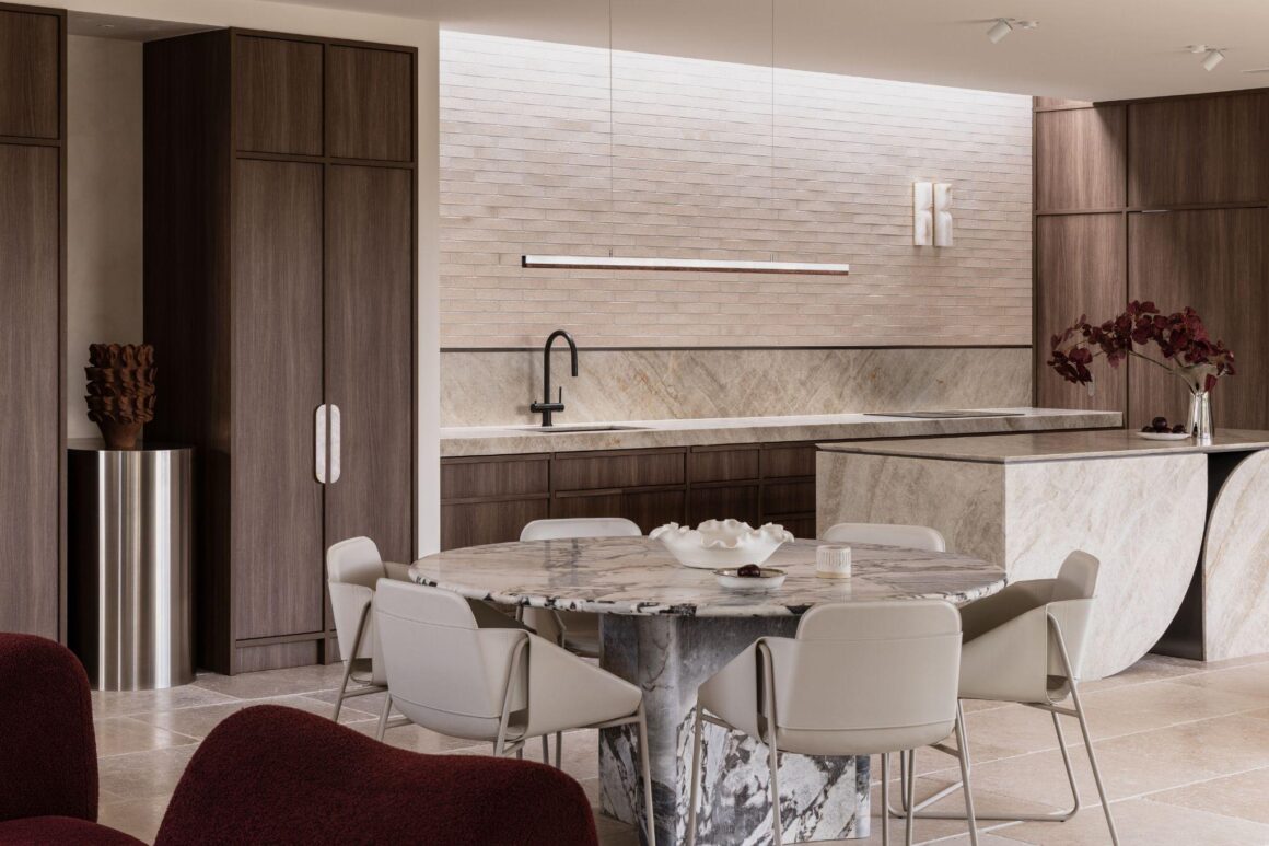
If material consistency is the goal, tonal layering is how you get there. Instead of creating interest through dramatic colour contrast, the approach is to build depth through subtle variations in texture and surface finish, all held within a coherent tonal range.
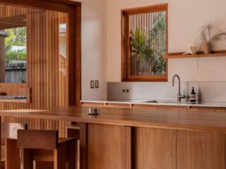
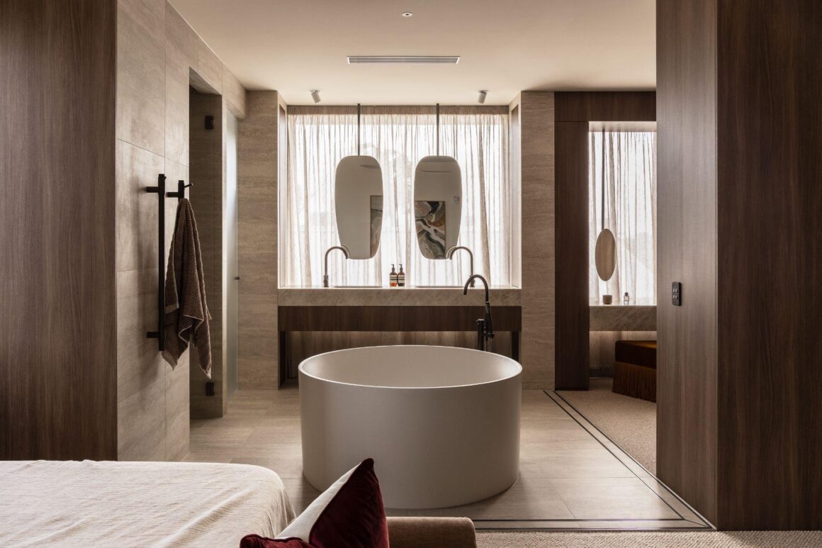
Natural stone is one of the most effective materials for this. Travertine, limestone, and sandstone each exhibit internal variations, including veining, colour shifts, and surface irregularities, that create visual movement without introducing contrast. Pair that with textured plaster walls in similar tones, or warm timber grain, and you have a layered interior that feels rich without feeling busy.
A few materials driving this trend right now:
- Travertine and limestone are warm, tactile, and rich in natural variation
- Pale oak and walnut are used across vanities, shelving, ceiling details, and bath panels
- Matte finishes absorb light rather than reflect it, creating a grounded, natural feel
- Textured plaster adds depth and softness to walls without relying on colour
- Large-format tiles create uninterrupted surfaces and a more continuous sense of flow
How Tiles Fit Into the Picture
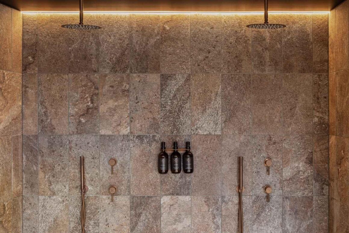
At ABI Interiors, tiles are treated as a design decision not just a practical one and in quiet luxury interiors, that distinction matters. Tile selections are increasingly guided by how they contribute to the home’s overall atmosphere rather than purely by their function in wet zones. Stone tiles can soften and warm the quality of light in a bathroom, while large-format tiles that flow from one room to the next create a stronger sense of continuity.
What’s replacing the old approach of treating tiles as an afterthought:
- Stone-inspired finishes in earthy, warm neutrals
- Large-format tiles that reduce grout lines and read as a continuous surface
- Matte and textured surfaces over high-gloss
- Consistent tile families used across multiple rooms
- Indoor-outdoor continuity through related floor finishes
When these choices are made as part of a considered whole rather than room by room, the result is a home with a material language that feels genuinely resolved.
Designing Spaces That Age Gracefully
The homes that age most gracefully are usually guided by a consistent material vision, where each decision contributes to a sense of continuity throughout the home.
That means resisting the impulse to anchor a room around a single material or finish that’s distinctly of its time, such as a very specific tile pattern, a highly saturated grout colour, or a surface treatment that reads as a direct response to whatever was trending that year. These decisions do not date because they were wrong, but because they were too specific. The home ends up carrying the renovation’s timestamp rather than developing an identity of its own.
Working within a broader, more moderate material palette allows a home to evolve over time. Furniture changes, soft furnishings are updated, and artwork is moved and reintroduced in new ways. When the underlying surfaces, such as flooring, tile, and wall finishes, sit within a cohesive tonal range rather than asserting themselves as individual statements, they accommodate these changes without resistance. The underlying structure remains consistent, providing a sense of continuity as the interior naturally evolves.
It’s also worth thinking about how materials perform over a longer cycle. Some surfaces peak at installation and gradually lose clarity over time, while others, including quality stone, timber, and textured plaster, continue to settle and develop character as they age. Rather than deteriorating, they evolve. A matte stone-effect floor, for instance, can feel resolved from the outset, become more considered after five years, and increasingly characterful after a decade.
Quiet luxury isn’t a restraint for its own sake. It’s about making decisions that give a home room to evolve, becoming more itself over time rather than being locked into a single point of expression.